Make Well-Designed Excel Dashboards That Inform & Impress
Creating Excel Dashboards from scratch is not easy.
Do you spend a lot of time thinking about how and where to start?
Do you feel overwhelmed by the complexity of the process, leaving you regretting every time you open the file? Unfortunately that’s a common scenario if you use the wrong techniques.
This Excel Dashboard Creation course helps you streamline your dashboard creation process. You’ll learn simple steps to go from idea to delivery. You’ll create Excel Dashboards you’ll be happy to come back to.

20 years of experience in Excel and still a lot of stuff to learn in a progressive structure. With a pleasant and engaging instructor.
Our courses are popular among financial analysts, CFO’s, and business owners


What You’ll Learn
In this course, you’ll master the art of creating well-designed Excel dashboards. As a result, both you and your colleagues will be empowered to spot trends and make swift, data-informed decisions. Furthermore, the course covers:
- How to add interactivity to your Excel reports – No VBA required
- Clever use of Excel core functionality for responsive spreadsheets
- Use powerful visual techniques so your content has more effect
- Impress management with reports that make the decision-making process faster
- Create impressive, non-standard Excel charts using smart techniques
- Learn how to create a professional KPI dashboard from scratch
- Build Pivot Table-based dashboards for easy interactivity
This Excel Dashboard Creation course comes with templates, tools and checklists that can be applied directly to your Excel reports.
This course was recently updated to include the Office 365 & 2021 version of the KPI dashboard. You can download the alternative dashboard if you have Office 365. You’ll learn how you can use FILTER, SEQUENCE, XLOOKUP and other newer Excel functions to create the dashboard
Watch the Video for a Quick Overview of the Course
“But Leila, Why Learn Creating Dashboards from You?”
What differentiates this course from the other Excel Dashboard courses:
- The entire process from idea to delivery – every single step without skipping key points.
- Tried-and-trusted techniques that are not only applicable to Excel dashboards but any Excel report.
- Includes Excel templates, tools and checklists that you can use for your own Excel reports.
- Relevant and up-to-date with industry needs right now, as it’s based on feedback and suggestions from finance professionals.
- Lots of ideas and inspiration to help you come up with own report design.
- Complex topics are taught in a simple way by an instructor with 17 years of experience.
How is this Excel Dashboard Creation course structured?
The course is designed to have an even balance between talking head explanations and screencasts.
The course content is meticulously organized, allowing more advanced learners the flexibility to seamlessly jump in at any point. Additionally, each section is accompanied by the relevant project file for easy follow-along.
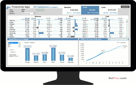
You learn how to create this interactive KPI dashboard from scratch:
Here’s The Thing:
You don’t just learn how to create this dashboard, but you end up learning:
- The process you should follow for a successful Excel dashboard Project.
- Advanced formulas that will come in handy if you ever do complex analysis in Excel.
- Smart use of Excel’s core functionality to get impressive results.
- Form controls without VBA to add impressive interactivity to your report.
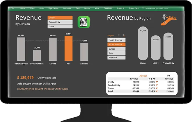
You’ll also learn how to create a Pivot Table-based-Dashboard, that uses Pivot Charts & Slicers like this one:
As you progress through the course, you’ll also discover a variety of neat Excel tricks. For instance:
- How to VLOOKUP on pictures
- How Excel’s camera tool can add a unique and professional flair to your reports
- How to create charts that are conditionally formatted
- And impressive charts based on Pivot Tables

Many thanks to Leila for this very comprehensive course, for her diamond clear explications and for the very high level of all the topics that I’d define almost esoteric … my best ROI ever!
🎁 Bonus eBook To Follow Along
You’ll find that the course alone is A+
But we want to make your learning experience even more enjoyable with our step-by-step eBook.
This handy guide covers every single step we take to create each dashboard, to make sure you never miss a beat. Having the eBook as your companion ensures that following along and mastering each concept in Excel becomes effortless, thereby making your learning journey both enjoyable and rewarding!

I am completely in love with this course. Leila is awesome, explains very well and it is very easy to understand her explanations. The examples we see during the classes are so enlightening and applicable to the “real world”. Fantastic course!!!
Here’s Your Curriculum
You can view the detailed curriculum below. Click on “See a full outline” at the bottom to expand the curriculum.
See anything that jumps out? Which lesson do you think you’d begin with?
Visually Effective Excel Dashboards
Actionable Excel tips (templates & workbooks included) you can use right now to create eye-catching Excel dashboards.
This course includes:
Over 11 hours of video content
Downloadable Workbooks and Templates
Build 2 Fully Functioning Excel Dashboards from scratch
Exercises & Quizzes to test your skills
LIFETIME Access so you never feel rushed
Comment sections to ask questions and get answers from our friendly teaching assistants
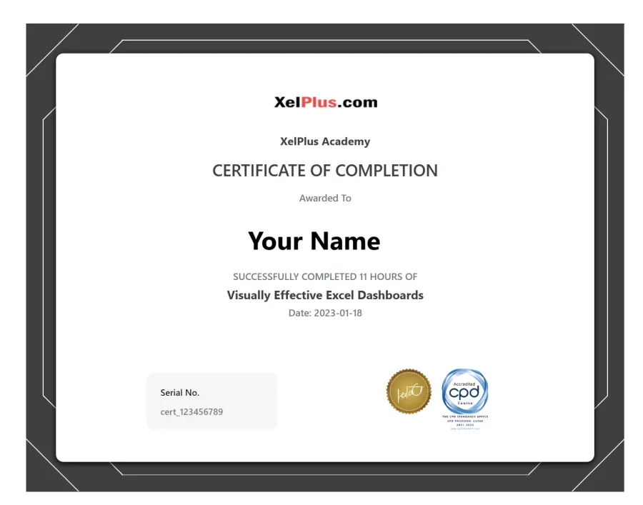
CPD Accredited Certificate of Completion
English Closed Captions
Bonus Course eBook to easily follow along
Section 1: A Foundation in Dashboards
Section 2:
Section 3: Report Design Principles
Section 4: Dashboard Source Data & Formats
Section 5: Excel Dashboard Formula Toolbox
Section 6: Form Controls for Interactive Excel Dashboards
Section 7: Advanced Excel Chart Techniques
Section 8 – 13: *** KPI Excel Dashboard – Start HERE ***
Section 8: KPI Excel Dashboard Setup
Section 9: KPI Dashboard – Scrolling Table & Bars
Section 10: KPI Dashboard – Dynamic Headers
Section 11: KPI Dashboard – Top/Bottom KPI Based on Selection
Section 12: KPI Dashboard – Scrolling Line Chart with Check Boxes
Section 13: KPI Dashboard – Final Touches
Section 14: *** Regional (Pivot / Slicer) Dashboard ***
Section 15: Regional Dashboard – Advanced Excel Pivot Table Techniques
Section 16: Regional Dashboard – Impressive Charts Using Shapes
Section 17: Dashboard Secrets for Impressive Excel Reports
Section 18: What You Learnt

Click the Big Blue Button To Get Started
Create Eye-catching Excel Dashboards
I’m Leila.
Nice to meet you.
Each month, I hop on a special video call with the Microsoft team. This is one of the perks of being a Microsoft MVP. They fill us in on all the latest features coming down the pipeline.
My courses & tutorials are for ambitious beginners and professionals who want to upgrade their data analysis skills. If you hate doing things manually, you’ll love my approach.
I don’t just want to show you solutions to specific problems, but to teach you to find solutions to ALL your future data analysis problems.
I founded my online learning company, XelPlus, in 2015. Our aim is to help you gain the knowledge you need so you can create useful tools, solve problems and get more done.
Let’s get started!

Who Is Right For This Course
You’re in the right place if …
- You’re a Business Professional who uses Excel to create dashboards and reports.
- You currently use Excel and want to improve your skills.
- You’d like to learn how to create interactive reports in Excel.
- You’d like to improve the design of your existing Excel reports.
Who’s Not Right For This Course
You’re in the wrong place if …
- You don’t use Excel often.
- You consider yourself a very basic Excel user (The course requires solid knowledge in formulas like IF and features like absolute and relative referencing). If you aren’t familiar with these, please check out my Excel Essentials Course.
- You don’t have Excel for PC (Windows) – The course is taught for Excel on Windows. Please note, for Mac users, our support capabilities are limited, which might affect assistance in case you encounter difficulties.
🆕 Earn CPD Credits
I’m excited to announce this Excel Dashboard Creation course is now CPD certified. The Continuing Professional Development is a top global accreditation, trusted by companies and industries worldwide.
Upon successful completion of this course, you will be awarded a special certificate, proudly featuring the official CPD stamp, as a recognition of your achievement.
You will earn 11 CPD hours with the course.
If CPD credits can help in your career, this is not a course to skip.
📃 Get a Certificate of Completion
Upon finishing the Excel Dashboard Creation course, you will receive a certificate of completion, marking your accomplishment in this specialized area.
You can send it to your boss, upload to LinkedIn, or just add it to your own person library of learning achievements.
❓Frequently Asked Questions
When does the course start and finish?
You’ll take this Excel Dashboard Creation course in your own time. It is a completely self-paced online course – so you decide when you start and when you finish.
How long do I have access to the course?
How does lifetime access sound? Once enrolled, you gain unlimited access to this course, allowing you to learn at your own pace on any device you own, be it now or in the future.
What if I am unhappy with the course?
We would never want you to be unhappy! If you are unsatisfied with your purchase, contact us at info@xelplus.com in the first 14 days and we will give you a full refund.
What if I have questions about the lessons? Can I get those answered?
Yes! Most online courses leave you on your own, but not here at XelPlus.
We have a team of helpful teaching assistants (TA’s) ready to answer your questions about each lesson. Below each lesson, you’ll find a comment section where you can ask a question about the topic. Our TA’s will chime in and do their best to help you.
Who can I contact if I have questions not addressed?
You can contact us at info@xelplus.com.
Save with a Bundle!
You’d like to improve in more than one aspect? Pick our Excel Black Belt Package.
This Dashboards course is a part of our Black Belt Package. Learn anytime that suits your schedule.
Visually Effective Excel Dashboards
$99.00
Actionable Excel tips (templates & workbooks included) you can use right now to create eye-catching Excel dashboards.

Black Belt Excel Package
$679
Save $452 with a bundle!
Our Black Belt Package is your gateway to becoming an Excel Grand Master. With this package you get exclusive access to courses not available as stand-alone. Our step-by-step guidance makes learning easy, so you can say goodbye to confusion and frustration and hello to mastery.
Courses included
- Excel Essentials for the Real World
- New Excel Functions in Office 365/2021
- Visually Effective Excel Dashboards
- Unlock Excel VBA & Excel Macros
- Power Excel Bundle
- Only as Part of the Bundle
- Advanced Excel Tips & Formulas (Excel 2010)
- Excel Charts & Visualization (Excel 2010)
- Ultimate Excel Waterfall Charts
This means you get
- Over 100 hours of video content (CPD Credits)
- Certificate of Completion for individual courses
- 600+ Workbooks and Templates
- 200+ Challenges & Quizzes to test your skills
- LIFETIME Access so you never feel rushed
- Comment sections to ask questions and get answers from our friendly teaching assistants